SCREEN PRINTING
Screen printing is definitely not an exact science! It is an art form that dates back to the Ancient Egyptians. The process hasn't changed that much, but the materials and techniques have been perfected over many, many years. Coordination between the screen printing department and the art department is crucial to creating a great print. It does no good to have great artwork and then pair that with the wrong screen mesh, the wrong ink color or viscosity, or the wrong printing sequence. The end result will be sub-par at best. We spare no expense on the materials and supplies that go into creating outstanding prints, and we also spend time educating our staff and our customers on what it takes to end up with truly professional screen printing.
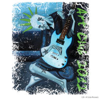
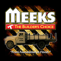
Here are a few examples of some of our past designs. Feel free to contact us to talk about the art for your next project.




FILE FORMATS AND HOW THEY ARE USED
You may have heard screen printers talk about "vector" files or "camera ready artwork," but you may not be sure what these terms mean exactly. In simple terms, vector artwork can be scaled indefinitely and the image will look exactly like it did at its original dimensions. Images enlarged on a computer where each "pixel" or squared edge becomes visible is not vector, and will create very poor prints at the screen printing press. Working only with vector artwork allows us to enlarge small images to t-shirt size, or reduce large images to fit tiny newborn onesies - all while maintaining super sharp shapes and colors.
The best file format for any type of printing is .ai or .eps. These are vector files we can readily work with to help create your artwork. Another file format that is often vector is .pdf. It takes just a second to open these files to determine if they are vector or not.
So what if you only have .jpg or .bmp to send us - or you don't have any images at all? No worries! Our artists can take your idea and create the vector art needed for your project. We keep everything on file, and backed up off-site, so if you ever need these files for your own records, you can purchase them from us at a very affordable price.
HOW ART GOES FROM THE COMPUTER SCREEN TO YOUR SHIRTS
We use multiple steps and sophisticated software to get your ideas from concept to a finished product. Our highly trained art staff begins by creating your design, and then separates each color onto film positives. Once the film positives are created, we use a giant light box to burn the image on the film into a screen coated with light-sensitive emulsion. The design area of the film blocks the light from hitting the emulsion and is then washed away - leaving open areas in the screen that we can push ink through and onto a shirt! It all sounds very simple, but actually producing a perfect screen takes precise skill and extensive knowledge.
Here is the process in visual form. We'll use our logo an example of color separation.
Here is the full-color image as you will see it on your shirt.

Here is what the colors look like when they are separated for each screen needed to print the design.


Once the screens are created, it takes a skilled press operator to marry each color so that the final product is perfectly registered!
QUALITY SETS US APART
It is easy to tell good, quality screen printing from the amateur products created by unskilled print shops.
Texture
Quality screen printing should have a nice smooth texture. You should be able to gently stretch the print without cracking or separating the ink. There should be little to no texture to the ink itself, and the colors should be true to the ink swatch you used to select your ink color. Here are examples of what to watch out for when looking for a good print shop.
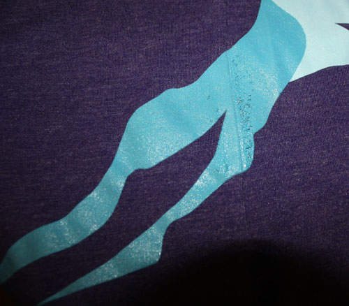
In the print above, you'll notice that the ink coverage is uneven and as the design tapers into the lower left corner, there is almost a grapefruit-peel texture to the print. Not good!
Underbase
Anytime you request a print on a dark garment, you should have a conversation with your printer about whether or not they use an underbase ink at the press. Most of today's ink is only semi-opaque at best, so laying down a layer of white ink first, creates a lighter palette for ink colors to show up as they are intended to be. We'll use our logo again as an example of what a design looks like with a white underbase and without one.
With an Underbase - Notice the bright, crisp colors!
Without an Underbase - Notice how dark and muddy the colors appear!
